While working for Faiza Shaheen‘s parliamentary candidacy campaign, I developed a range of different data visualisations from party data. We used these visualisations to make our campaigning strategy more effective.
During this time, I was also attending hack days organised by Campaign Lab, a group of sympathetic coders, data scientists, and tech-savvy activists who would put together useful little tools for campaigners.
I had also been chatting to people organising in other constituencies, and it became clear that most were not making use of the data they had access to. So, together with Louis Schamroth-Green who I had just met at a hack day, we set about making another useful little tool using R Shiny and the scripts I had developed in Faiza’s campaign team (available on GitHub).
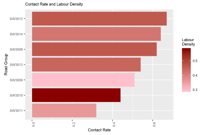
The data visualisation in this case did not need to be complicated. In fact, the more complicated it was, the less helpful it would be in the busy high-pressure environment of an election campaign. One of the simplest yet most useful figures the tool produced is the density of Labour voters plotted against the contact rate. Organisers can very quickly see which areas need more canvassing, which have been pretty well saturated already, and which can be missed out if resources are tight.

We also made figures that showed opposition party densities and turnout propensity. After a few rounds of testing with an organiser in another constituency, once we were happy with the output, Campaign Lab organisers put it out through their networks. We’d had a couple of inquiries from organisers after it went out (including to ask for more functionality), and website usage stats from the penultimate week of the campaign suggest that many more used it than we knew about.
All in all it was a small success: I learned to use R Shiny, we helped organisers be more data-driven, and we have many more visualisations and other improvements to the tool in time for the next elections.
